Why should you read this blog?
2.5 quintillion every day or 28.9 billion every second. The data universe expands with these many bytes of data. This means organizations are empowered more than ever to use data. On the other hand, according to BARC (Business Application Research Center), Germany, only 57% of companies use data to make business decisions. Amongst them, there are a few companies using results further.
Amidst this constantly growing data landscape, getting accurate results is not enough. Businesses that use those results gain a competitive advantage. If you want to expand your data visualization horizon beyond charts, graphs, maps and dashboards, this blog, ‘data visualization trends for 2023,’ is for you.
Did you know?
In the average adult human brain, 400 billion bytes of data reach the brain per second. From that, we hardly use 2,000 bytes. That makes us aware of the self and our surroundings. It also works as the base of forming 3,000 decisions each day, meaning 2 decisions per minute. Can you imagine how many decisions businesses make worldwide?
How data visualization trends for 2023 help you to go beyond charts, graphs, maps and dashboards
As organizations expand their digital infrastructures, the amount of data generated and collected increases alarmingly. This data deluge presents a new challenge: simplify vast or complex amounts of data while ensuring that your data provides insights. Apparently, this is the goal of many organizations. As a result, proper data visualization consulting services and understanding data visualization trends are critical.
Data360 Program = Customized Consulting + Services
In this post, we dig into the best data visualization trends to help you get a good ROI on your data visualization investment. You will learn:
- How can your data visualizations improve executive decision-making by providing them instant access to charts, graphs, or data-driven images?
- What factors contribute to the effectiveness of data visualizations through interactivity with the underlying data?
- How can data visualizations drive business strategies by encouraging brainstorming?
- Why are data visualizations the most effective way for the human brain to comprehend massive amounts of data?
Through this blog post, we will explore the following four data visualization trends:

The questions mentioned above only cover two departments, sales and purchasing. Think of the advantages of quickly comprehending a diverse and complex dataset and verbalizing an answer. Data visualization techniques empower this ability and enable you to impact every company department – from asset management, human resources to production, accounting and finance, and marketing.
How do the results of immediate data availability empower decision-making?
Real-time insights: With instant data access, decision-makers can analyze real-time data to identify trends, patterns, and anomalies that could go unnoticed.
Solve problems faster: Real-time data helps companies identify and analyze problems quickly. This allows them to take swift action to address issues before they escalate.
Improved accuracy: With real-time data, decision-makers can make accurate decisions, reducing errors based on outdated or incomplete data.
Increased agility: Immediate data availability enables agile responses to change business environments, making strategy pivots or adjustments based on real-time insights.
P.S.: Visualizations should make it simple to understand the relationships, patterns and stories hidden within a data set. This is why they are so powerful.
Data visualization techniques enable you to impact every company department – from asset management, human resources to production, accounting and finance, and marketing – and empower decision-making in the mentioned above manner.
Since quick decision-making saves a company’s time and money and provides a competitive advantage – data visualization tools and techniques are in high demand.
Overall, immediate availability of data empowers decision-making by providing decision-makers with the information they need to make informed, efficient, and effective decisions in a timely manner.
Suggested: Transform your business with AI and Data Engineering: Why do 83% of CEOs want their enterprises to be more data-driven?
Interactivity is the new norm in data visualization trends
Interactivity with the underlying data is one of the best features of modern data visualization tools. In other words, a visual is not static. You can drill into different views of your data on the fly by clicking on different visual parts.
A few years ago, the suppliers of the largest automakers, like Toyota and General Motors, began using visualization tools during meetings. It was a smashing success. These vendors no longer use traditional spreadsheets and presentation tools. When the chart is displayed on the screen and the client asks a question that requires a different view of the data, they can quickly drill into that view.
Let’s take another example. Suppose you run a media agency and your firm covers the election event. Naturally, visitors on your site will look for the following information:

Immediacy is the new data visualization trend
The ability to make quick decisions is arguably the competitive advantage for a business today. Why is speed so vital? Because it is what keeps you ahead of your competitors in a fast-paced world.
Let’s understand how real-time data and insights can help companies make quick decisions. Imagine that you have 50+ wholesale stores across your country. With such store numbers, it asks for sincere efforts in maintaining inventory efficiently and increasing sales. With traditional methods, by the time your reports about current sales and inventory data are ready, they are almost a few weeks old.
On the other hand, data visualization tools can access data from your data pipeline in near real-time. Immediate access to sales and inventory data charts and graphs can help you answer the following questions:
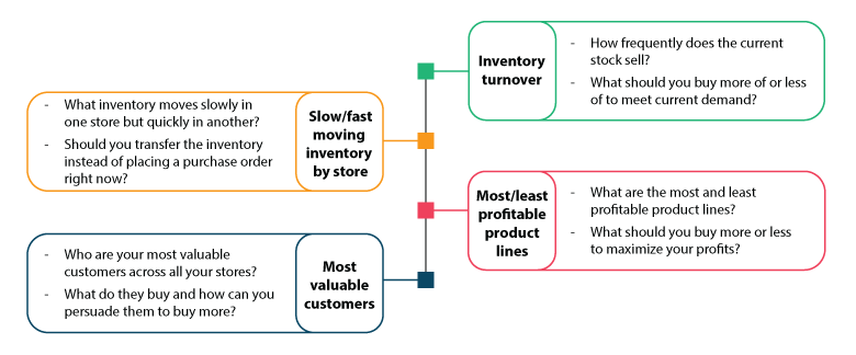
The questions mentioned above only cover two departments, sales and purchasing. Think of the advantages of quickly comprehending a diverse and complex dataset and verbalizing an answer. Data visualization techniques empower this ability and enable you to impact every company department – from asset management, human resources to production, accounting and finance, and marketing.
P.S.: Visualizations should make it simple to understand the relationships, patterns and stories hidden within a data set. This is why they are so powerful.
Since quick decision-making saves a company’s time and money and provides a competitive advantage – data visualization tools and techniques are in high demand.
Interactivity is the new norm in data visualization trends
Interactivity with the underlying data is one of the best features of modern data visualization tools. In other words, a visual is not static. You can drill into different views of your data on the fly by clicking on different visual parts.
A few years ago, the suppliers of the largest automakers, like Toyota and General Motors, began using visualization tools during meetings. It was a smashing success. These vendors no longer use traditional spreadsheets and presentation tools. When the chart is displayed on the screen and the client asks a question that requires a different view of the data, they can quickly drill into that view.
Let’s take another example. Suppose you run a media agency and your firm covers the election event. Naturally, visitors on your site will look for the following information:
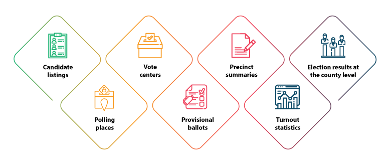
Instead of tables, numbers, or more text, what if you share interactive visualization with the readers? You can also configure data to refresh frequently to reflect the latest election news. Your readers can also drill down into election results at the ward-wise seat allotment. That’s the power of interactive data visualization trends.
The interactivity of data empowers decision-making in the following ways:
Customized analysis: The interactivity of data tools allows for customized analysis, providing a deeper understanding of the context and factors involved in decision-making processes.
Increased collaboration: Interactivity of data tools can encourage collaboration and communication between different departments or teams, leading to better decision-making.
Better prediction: Interactively visualizing predictive analytics data helps decision-makers identify emerging risks and opportunities, revealing insights for better predictions.
Enhanced transparency: Interactive data tools encourage transparency by enabling real-time data viewing for stakeholders, ensuring accurate decisions and enhancing trust.
Consideration: More than aesthetically pleasing packages of numbers and analytics, successful visualizations are interfaces to interpersonal engagement.
Ask questions is the emerging data visualization trend in 2023
We focus more on visualization to provoke human interaction rather than just effectively conveying complex information. Our data visualization consulting services include this approach. Consequently, our data visualization experts emphasize question one more than question two from the following.
Question one: What kinds of interactions and dialogue should our visualizations elicit?
Question two: What is the most efficient and user-friendly data presentation method?
The best maps and GPS provide two things: one, a sense of where you are right now. Second, an insight into where you might want to go next. Knowing where a trend may lead is critical information for executives for making decisions. If your smart visualizations give the same context, ride the trend with your data visualization consulting services provider. If not, you are losing out on a lot of opportunities.
Visualizations act as digitally dynamic portals for more detailed information. They effectively facilitate collaborative interaction that would not have been possible otherwise. We synthesize visualizations but not at the price of denying deeper and more granular views.
How asking questions to data empowers decision-making:
Clarifies objectives: On questioning data, you gain clarity on objectives. This helps in aligning your decision-making process to achieve them.
Identifies patterns and trends: Targeted questions to data identify patterns and trends, aiding understanding and predicting future outcomes.
Evaluates performance: Asking questions evaluates strategy performance, identifying areas for improvement and comparing the effectiveness of different strategies.
Enables data-driven decisions: Asking data questions allows data-driven decisions, boosting confidence as reliable data back them.
A valuable insight: Don’t view visualization as a medium that substitutes pictures for words. Instead, consider visualizations as interfaces to human interactions that open new avenues for value creation.
The ‘ask questions’ trend enables organizations to use visualizations as platforms to provide enterprise-wide understanding.
Suggested: How is data engineering your one-stop solution to overcoming key data challenges?
Use data visualizations for impactful storytelling
- Ten years of news corporation earnings data in less than a minute.
- 2053 nuclear tests and explosions between 1945 to 1998 in 14.3 minutes.
- 200 countries and 200 years of health, poverty and economic trends in four minutes.
Omit the minutes and reread the above bullet points. Does that sound like a massive amount of complex data? How would you shape the comprehensive story you want to convey to your audience? Using data visualization solutions or tools.
Understand this – time is on your side when it comes to making sense of enormous amounts of complex data. When time is the canvas for your data, you can use motion and interactivity for storytelling through visualizations.
Hans Rosling rose to prominence following his 2006 TED Talk. The talk covered statistics showing how different countries progressed through a lifespan and wealth trajectory beginning from 1810. The video below demonstrates the power of motion in explaining the complexities of health, poverty and economic trends.
Motion and interactivity in data visualization techniques help you tell a story to convey the message behind the numbers. It also facilitates people’s participation in storytelling through data if you allow it. The possibilities for illustrating complex data with data visualization solutions are limitless.
How storytelling through data visualization can help companies in decision-making:
Gain insights: Storytelling through data visualization can provide insights into company performance and customer behavior.
Identify improvement areas: Data visualization helps decision-makers quickly detect areas for improvement.
Foster informed decisions: Data visualization encourages debate and informed decision-making.
Improve profitability: Visualization helps companies make informed decisions to improve efficiency and profitability.
Knowledge tip: Determine what you want your audiences to see or understand from your data. Draw their attention to the message behind the numbers, not on the numbers, to convey information that resonates with them and compel them to act.
How to make the best use of data visualization trends
Use data visualization tools or techniques with the purpose. Do not use data visualization tools to simply generate charts, graphs and data-driven images or add animation for animation’s sake. Make sure you use it to convey meaning. Avoid using interactivity or motion as a type, as is common in many college animation assignments.
Make use of these data visualization trends to express growth and depth, encourage brainstorming and engagement, demonstrate progress over time, or highlight a piece of data. These are the best data visualization trends for 2023. These will give your visualized data more impact only if they work in agreement with the main goal: simplify vast or complex amounts of data while ensuring that your data provides insight.


